Sunday, September 20, 2026 | 12:41 AM

How Do Company Results Affect Share Prices? Corporate Earnings, EPS & Stock Valuation

Illustration showing corporate earnings, earnings per share (EPS), and stock valuation with financial reports, rising market charts, company buildings, coins, and analysis tools to explain business performance and investment value.

Ever wondered why a company’s share price jumps after one quarterly result and tanks after another? The answer usually comes down to the company’s financial performance and what investors expected. Every quarter, listed companies release their corporate earnings, offering insights into their revenue, profits, expenses, and overall business performance, along with their future direction.  At … Read more

Futures vs Options Trading: What’s the Difference

Illustration comparing futures trading and options trading with stock market charts, Call and Put contracts, price movement indicators, and investment icons to explain the differences between the two derivative trading methods that are future and option trading.

A lot of people discover the stock market after hearing traders talk about Futures and Options Trading. These instruments have picked up real popularity since they let you benefit from market movements without directly buying shares. But beginners often struggle to tell the two apart. Futures and Options both sit in the Derivatives market, yet … Read more

What Is a Dividend and How Does It Work? A Beginner’s Guide

Illustration explaining dividends with stacked coins, a dividend payout bag, upward growth chart, and rupee symbols, representing shareholder income, company profits, and long-term stock investing.

If you’ve ever invested in shares or mutual funds, you’ve probably heard people talk about earning dividends. Plenty of new investors assume stock market returns come only from rising share prices, but many companies also reward shareholders by sharing a slice of their profits directly — that’s a dividend. For long-term investors, dividends can become … Read more

Risk-Adjusted Returns: A Simple Guide to Measuring Investment Performance

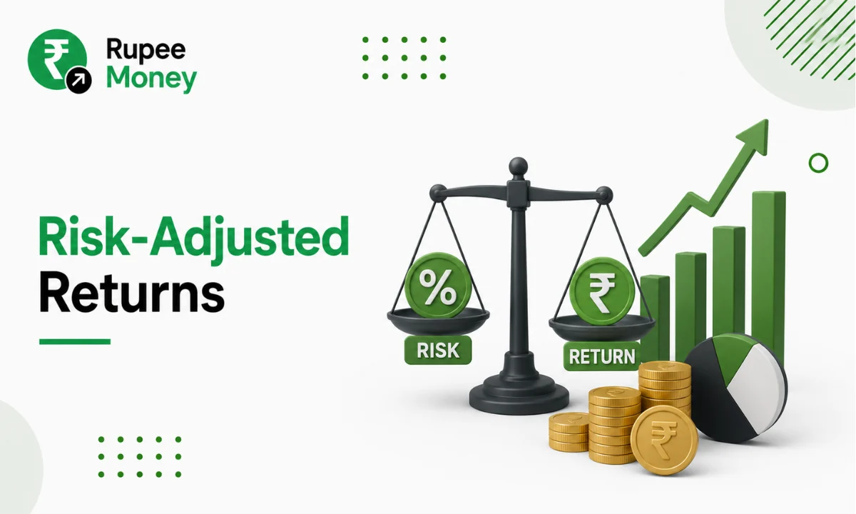
Risk-Adjusted Returns infographic illustrating the balance between investment risk and returns with a weighing scale, financial growth chart, pie chart, and coins, highlighting smart investing and portfolio performance.

Picture two mutual funds that both delivered a 15% annual return. At first glance, they look equally good. But what if one achieved that return with relatively steady performance, while the other lurched through sharp ups and downs all year? Most investors would naturally prefer the fund that hit the same number with far less … Read more

Direct Mutual Funds vs Regular Mutual Funds: Which Investment Option Is Better for You?

Illustration comparing Direct Mutual Funds vs Regular Mutual Funds with investment dashboards, advisor icons, and rupee coins, highlighting the differences in investment approach, costs, and fund management.

If you’ve started exploring mutual fund investing, you’ve probably run into two versions of the same fund: a Direct Mutual Fund and a Regular Mutual Fund. Both invest in the exact same portfolio and are run by the same Asset Management Company (AMC), yet they differ meaningfully in expense ratio, distribution commission, and, over time, … Read more

Gold and US Dollar Relationship: Why Gold Prices Move When the Dollar Changes

Gold and US Dollar relationship infographic showing gold bars and a US dollar with market trend arrows, illustrating how gold prices and the US dollar influence each other in global financial markets.

Why does gold often get expensive right when the US dollar weakens? And why does a strong dollar sometimes drag gold prices down? The gold and US dollar relationship is one of the most closely tracked patterns in global finance, and it quietly shapes what Indian buyers pay for jewellery, what digital gold investors earn, … Read more